





Packaging
Goldnutz
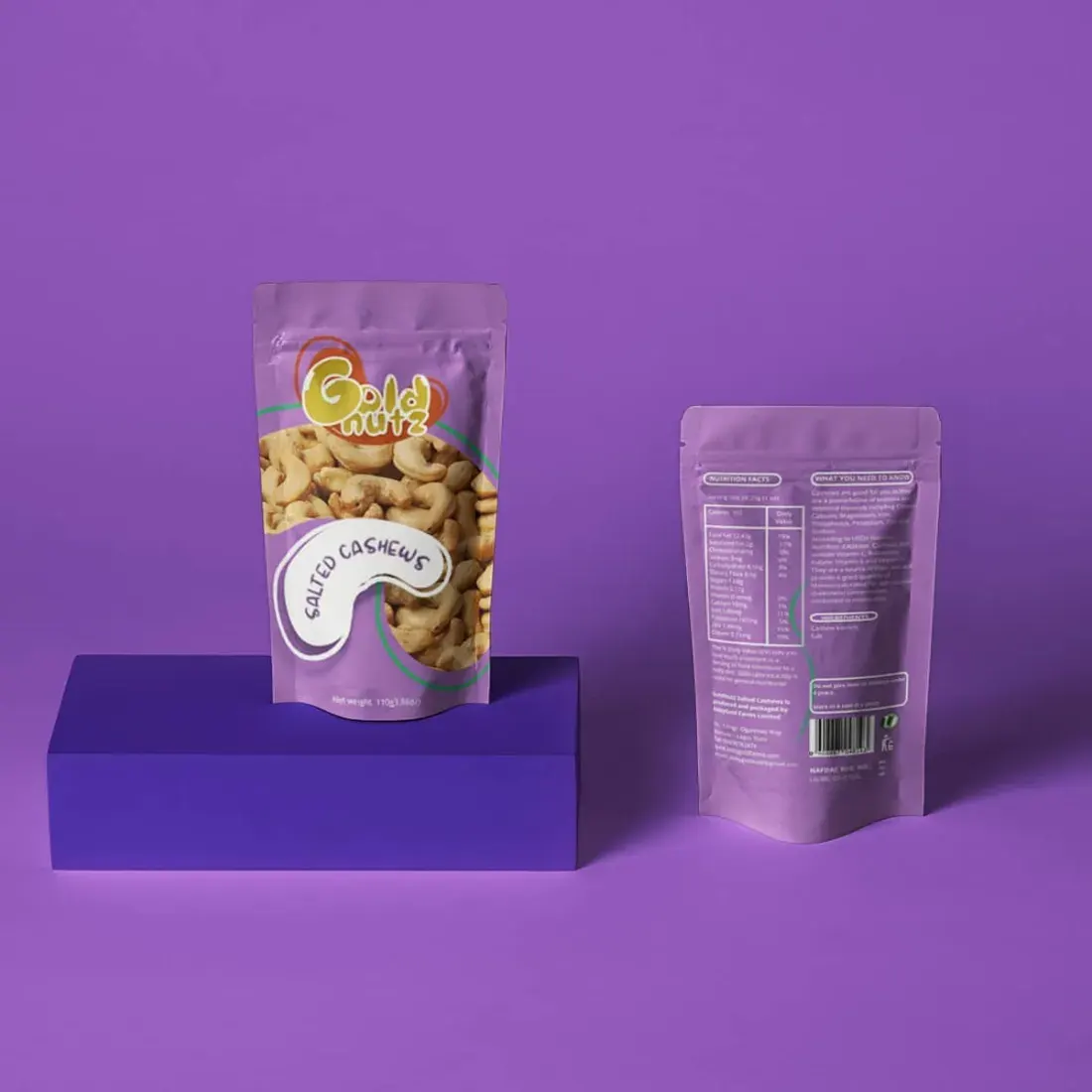
The resultPackaging that reads from across the aisle and rewards the second look.
The challenge
On a shelf, a pack has a few seconds to be noticed and understood. Goldnutz needed packaging that could do both, and look like a brand people would come back to.
The assumption
"A good product sells itself."
Every brief has one. It's the belief nobody checked, and it's usually what's costing the most.
The play
We designed the pack to read from a distance first: name, product, appetite. The detail is there for the second look, once the shopper has picked it up.
The system is built to stretch across sizes and variants without losing what makes it recognisable.
Scope
Pack design · Label hierarchy · Variant system · Print-ready artwork
Faith Imdu Foundation